TAEYOBOX
A Fresh Look and Feel
HIGHLIGHTS
Brand identity
Primary and secondary logos
Color palette
Typography
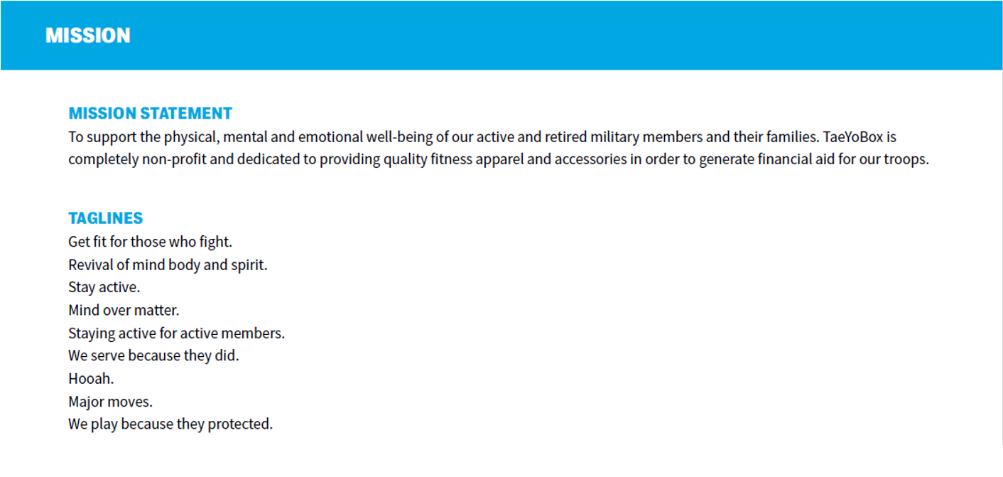
TaeYoBox’s mission is to support the physical, mental and emotional well-being of our active and retired military members and their families. TaeYoBox is completely non-profit and dedicated to providing quality fitness apparel and accessories in order to generate financial aid for our troops. TaeYoBox’s fearless leader, Frank, approached me to help him give his brand a fresh look and feel.
LOOK AND FEEL
CHALLENGES
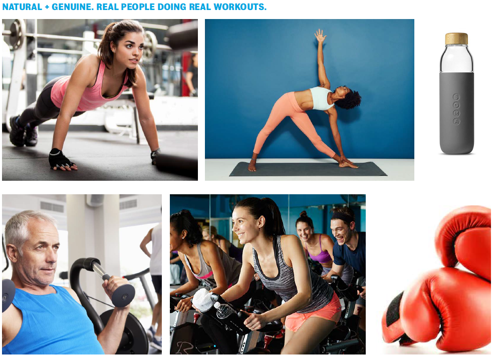
With lots of passion and fortitude, Frank had no shortage of innovative ideas. My challenge was to translate all the amazing work he and his company was doing into a single, focused message. Because his Brand was so rooted in veteran support, I also wanted to convey that and honor our troops through TaeYoBox’s identity. At the same time, I wanted to create a design system that still felt modern and appealed to a younger audience interested in fitness.
COLOR PALETTE
TaeYoBox’s color palette is a contemporary twist on the historic national colors of the United States. These brightly revisted traditional colors bridge TaeYoBox’s respect and homage to American pride with its goal to appeal to 21st century customers. As a brand that provides quality fitness apparel, these energetic colors mimic the attitudes of TaeYoBox’s consumers: motivated, active and energized; and will provide an eye-catching anchor to further spread brand awareness.
DESIGN SOLUTION
In the end, I was able to deliver a brand identity that remained true to the spirit of TaeYoBox’s commitment to United States Veterans while maintaining a clean, modern look and feel that could live not only as a web and print asset but as an integral part of its apparel design.


