elkay.com UX/UI FRAMEWORK
An Accessible Design Built on UX Research
highlights
Information Architecture research
Design System
UX wireframes and UI samples
Web Content Accessibility Guidelines (WCAG) Compliance
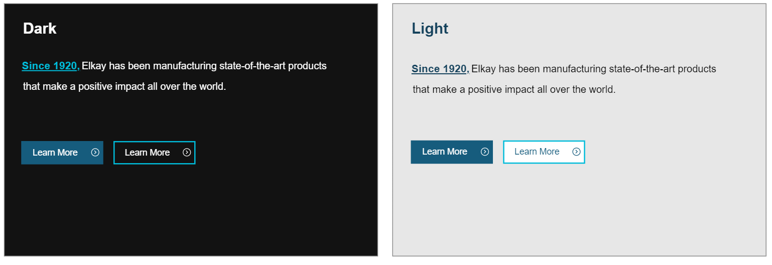
Dark Mode Optimization
Modern platform migration
It had been 9 years before Elkay Manufacturing’s main website, Elkay.com, had seen a major refresh. In 2019, I joined their web team just as they had decided to make the shift to a more modern platform. I immediately began working on leading art direction for this new Elkay.com experience. Having previously worked as a graphic designer in their Marketing Department, one of my major focuses was to bring our new brand look and feel to our online presence.
7 Total
Websites migrated
AAA WCAG
Compliance achieved
Up to 50%
Increase in page speeds
Increase in User Satisfaction
User study conducted after the refresh found many of our users were pleasantly surprised by the new design. User expressed the site was “cleaner, easier to use and much faster” and on average above any competitor sites they’ve used.
With heavy code customization on the original site, this new platform gave us the opportunity to clean house and standardize our design system. Being a manufacturing site with both static content and data-driven pages, defining layouts, element styles and component rules was essential. I worked closely with the team to define a new main navigation structure that would expedite our user journeys.
Information Architecture Research
THE STUDY
Card Sorting Exercise: Users sort together items from a pool of identified ‘key tasks’ into groups based on relevancy. Users are then prompted to label said groups. In the end, we see which ‘key tasks’ were grouped together most often and which labels were used most frequently
Card sorting exercise sample
30
Total participants (Distributor, Influencer, Plumbing Engineer, Sales Representative, Showroom Consultant)
7
Average number of categories per participant
RESULTS OVERVIEW
Differentiating ‘content’ vs. ‘technical’ information
- Many users used audiences as a grouping element (i.e. Architects, Engineers, Consumers, etc.)
- Many of our competitors use audience groupings in various ways
- Growing need for scalable way to design categories for products that cross (i.e. filtration)
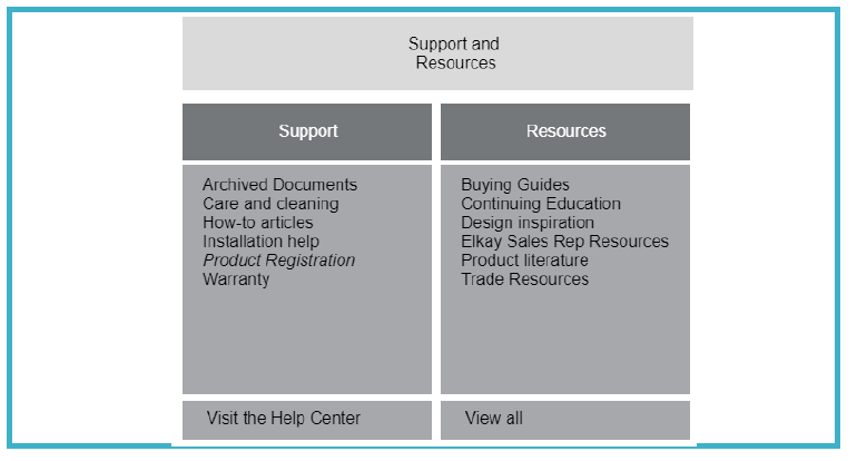
‘Support’ experience
- Most users grouped ‘register a product’ under ‘Warranty/Registration’ – Add product registration link to ‘Support’ section
- ‘Help Center’ link is a top task in current navigation –Surface as a CTA in the header
- ‘Archived Docs’ is a top task in the footer – Surface in the header
Corporate/Company Information
- Move all media, corporate and news information out of Plumbing site and onto Corporate.elkay.com
- ‘View industry news’ was most frequently grouped under ‘corporate/company’
- ‘Submit a media inquiry’ and ‘Learn about fundraising opportunities were most frequently grouped under ‘corporate/company’
- Competitor analysis showed most companies with large sub-brand ecosystems point to corporate resources vs. keeping within the domain
Lo-fidelity Navigation
Hi-fidelity Navigation
Desktop/table experience
Optimized for mobile and touch design


